I'll be inking my original tattoo designs soon!

The first time I ever designed a tattoo was a complete surprise. I doodled a sun-and-moon drawing where they shared the same face (sun had the left eye, moon had the right eye - same nose and smile - I wasn’t clever enough to take a photo back then). Several weeks later I was at a friend’s house and as we were getting ready to go swimming he pulled off his shirt and - boom- there on the right side of his chest was my sun-and-moon drawing. I was shocked - pretty sure I didn’t say anything for a few seconds - jaw on the floor. I was humbled that he liked it that much to get it tattooed on his body…forever.

Days later after the shock wore off I thought about that feeling of utter happiness that something I designed (from my imagination) would be selected as a piece of permanent art. It’s one of the best compliments an artist can receive (besides, someone saying “paint my wall whatever you want”).

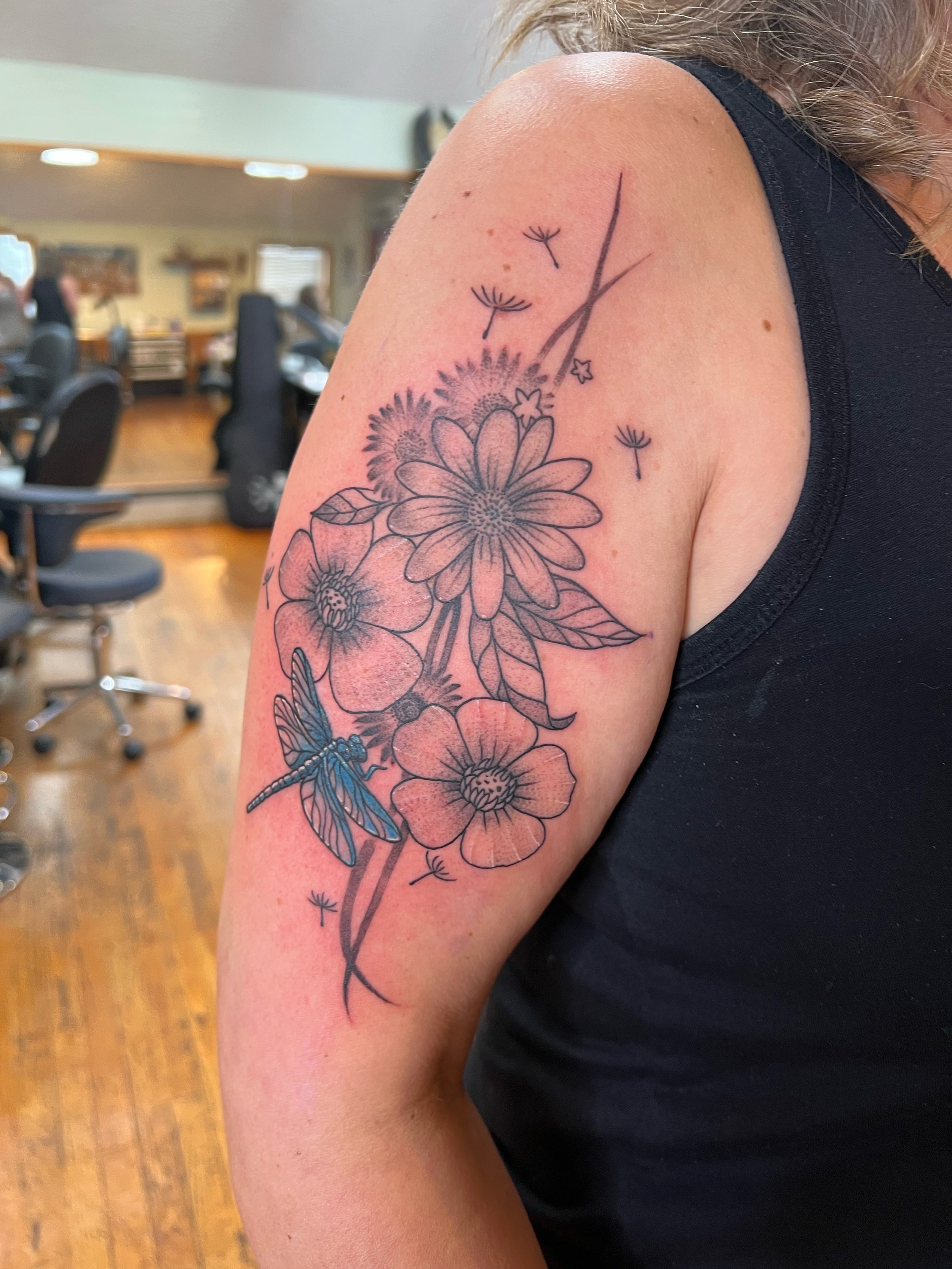
“Nature always Wins” design for my inner left arm

It was the beginning of a 20-year path that would gradually inspire me to choose a full-time artist’s life. Since then, I have designed for dancer friends, co-workers, strangers, and friends-of-friends. When I moved to Seattle I explored tattoo shops on my own, getting new ink myself and learning about the industry through friends, asking my tattoo artists questions and just observing. I attended Seattle’s Tattoo Expo several years in a row, watching different artists’ approaches to design, customer intake and aftercare. I even interviewed some of them informally, ending with a question about their interest in taking on an apprentice. I didn’t have any luck back then.

“Dance like the world is watching. Make it Count” dancer design for Sue Anne (co-founder of Tint Festival)

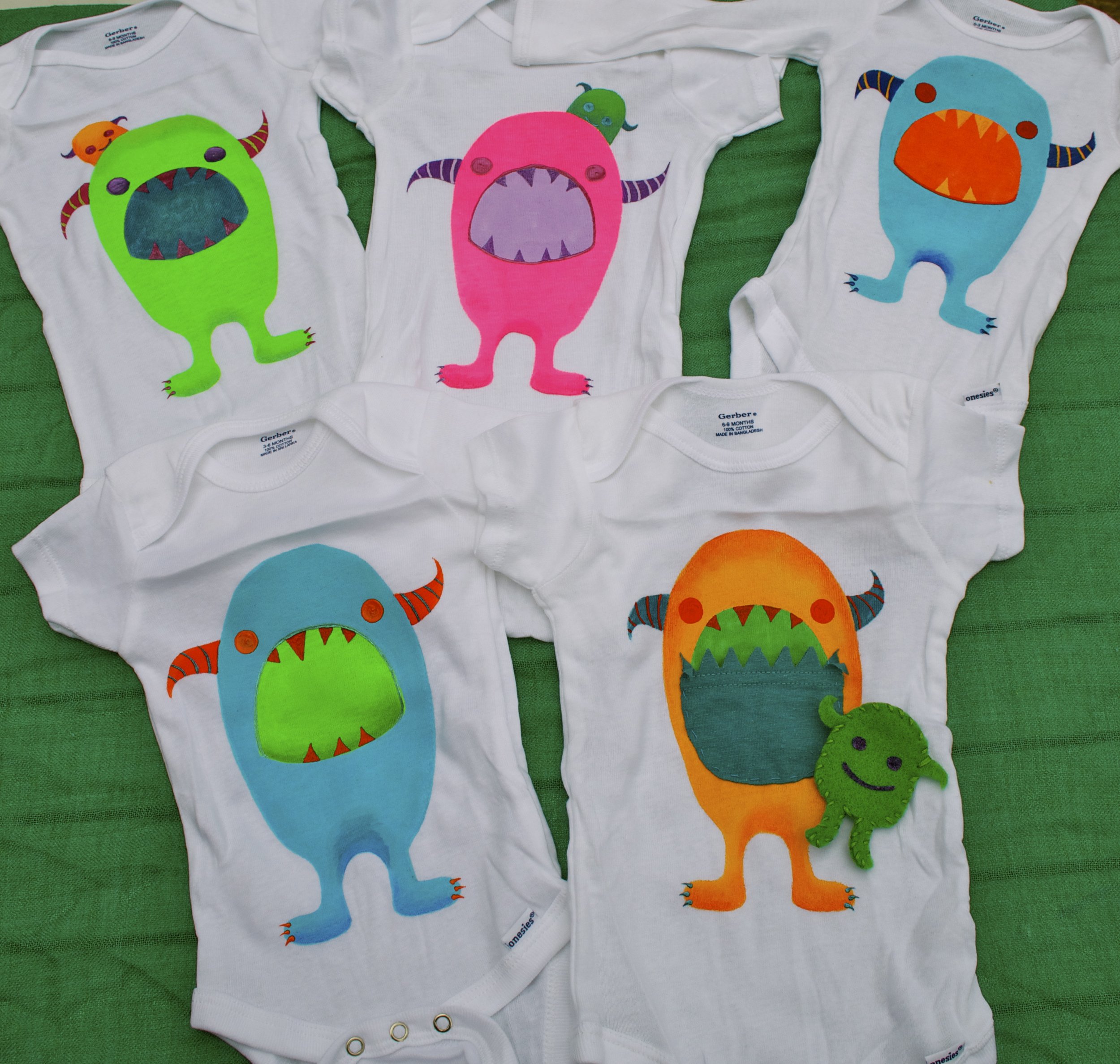
That didn’t stop me from pursuing the art form. I procured my own Stick-and-Poke kit during the pandemic and started tatting up lemons and grapefruit, watching hours of YouTube videos and realizing how much information was out there. It made me realize how uniquely special an apprenticeship is because of the one-on-one instruction and supervision to ensure you’re protecting yourself AND the client. It’s also the best way to ensure you don’t pick up any bad habits that can lead to infection or skin blow-outs. I’m very meticulous with my designs and I want to be meticulous in my learning.

Original design for Sarah Dolezal (owner of Muddy Cup in Seattle)

So, 2 months ago, when I ran into a friend who told me about a new artist in town who was actually looking for apprentices I didn’t hesitate to reach out. A month later my dream of starting a path to becoming a tattoo artist became a reality. I’m apprenticing under Emma Grace at Elevation Project in Capitol Hill. I absolutely love her work and have already soaked-up a lot of useful info - with years of training to go. In the meantime, I’ll still be designing tattoos with the goal of one day inking my original designs on my own clients!

Above: Dancer design for Alex, owner of Enso Bodywork, Turtle design for Christylee with the names of her two sons, Earth Compass design featuring earth, wind, water and fire and a Fire/Tree dancer.

Making Green Spaces Greener

During the week of the ‘23 Autumnal Equinox, I installed my largest mural yet! The 36 foot by 20 foot scene is in a courtyard surrounded by plants and trees. Via contract through Urban Artworks, who also provided me with 8 amazing volunteers (aka Dream Team), to rock it out in five days. I designed this work for Bellwether Housing to be enjoyed by residents for years to come. Many of them, and their super-friendly dogs, visited us during our progress over the course of the week.

Earlier this summer, I visited the courtyard to meet the client and see the wall in person. I’ll admit it was begging for art. It was kind of a vibe-killer.

The courtyard has lush bushes, seasonal flowers and trees that have hand-made birdhouses hanging from the branches. Many residents spend hours in this green space so I decided to simply expand it. I took photos of the plants and trees already there and designed a landscape that would transport the imagination. I drew a path leading into the background with an evergreen forest on the horizon. I also added a waterfall for tranquility. Who doesn’t love waterfalls?

The shape of the courtyard is rectangular so anyone who exits the main building can see the waterfall from the far end of the opposite side as soon as they enter the courtyard. I also wanted the design to compliment the tall trees on the left, which hang over the art so their leaves blend with my painted trunks. I used a sponge to add texture throughout; adding moss on the rocks, leaves on the path and of course mist on the water hitting the rocks at the base of the waterfall.

Dream team member in this photo: Katy Basnaw. Progress photos above: 1. outline using paint pens 2. blocking the solid colors in the middle and background 3. adding the ferns in the foreground 4. final work

Enjoy more content, including videos, on Insta. I’m so grateful for the amazing volunteers, Bellwether staff and Urban Artworks for support! I was there from 9am til 6pm most days and while my body was tired, my heart was soaring.

I Love a Good Makeover: Tukwila Utility Box Program '23

Last April I applied to a call-to-art from the City of Tukwila, Utility Box Art Program 2023. The program selects a handful of artists each year to create public art at specific locations and in June I received my acceptance letter. I’d be creating art for a vinyl wrap-around on utility box #208, which is located on Southcenter Parkway at the Old Navy shopping center entrance.

I was in the midst of creating my La Tierra collection when I got the news and had just finished “El Sol” and “Journey”. I wanted to create something bright for the box, taking into consideration the many months of moody overcast skies here in the pacific northwest. So I digitally enhanced and combined “El Sol” and “Journey” adding golds, greens, teals, purples and shades of turquoise to compliment a radiating yellow sun and glowing moon.

Each artist was provided with photos of our individual grey boxes and specific dimensions to help us plan accordingly. Below is box #208 before the vinyl wrap-around. This blank canvas really needed some color!

EL SOL © Nalisha Estrellas

JOURNEY © Nalisha Estrellas

The week it was installed I made a trip down south to see box #208 and - whoa, talk about a makeover - it looks gorgeous! It turned out better than I expected! The colors pop so vibrantly! It happened to be cloudy on the day I took these photos and it’s easy to see the full effect of my bright palette against that moody sky. I couldn’t be happier. I walked several laps around it smiling.

© Nalisha Estrellas 2023

I titled my work “La naturaleza es una companera” which means ‘Nature is a companion’.

Front of Tukwila utility box 208

Back of Tukwila utility box 208

2023 Bellevue Arts Museum Arts Fair: Chalk Mural

After being invited to be the 2023 Featured Chalk Mural Artist at Bellevue Arts Museum (BAM) Arts Festival, I visited BAM’s exhibit “Strange Weather”, which explores the relationships and boundaries between bodies and the environment.” The works of art hit those notes hard and each artist conveyed a message with their own unique lens. I remember the rich colors - saturated reds, rust-oranges, turquoise, yellows and greens. When I learned how BAM wanted my chalk mural to be inspired by the exhibit I knew I would be including a vibrant color palette.

I was asked to title my mural, which is the hardest thing for me to do for any piece I create. But after spending time with Strange Weather I had a solid idea. My mural’s title would be, Arrested Antidote. I chose it in an attempt to evoke reflection about our action/inaction with regards to body-and-land violence and the missed opportunities and contributions that are lost as a result. I wanted to depict people in the midst of migration and to some degree expedient exodus. The land masses would be unnatural and the sun would be a dark, ominous color to spotlight the changes currently underway in our environment(s). There would be waves of water and bubbles floating throughout each shape - each representing a breath.

I spent several hours prepping my chalk colors and labeling them according to each shape. I went back to my notes from the Strange Weather visit to ensure I was doing justice to my tribute. I kicked-off the first day by chalk-drawing a large circle (6 feet in diameter) and outlined everything. I spent a total of 18 hours on my design, but it didn’t feel like that at all. I think it’s because I had so much fun chatting with all the families, kids, staff and volunteers the entire weekend. I heard so many different languages being spoken, met people from all over the world and at when I painted the last stroke of chalk paste I felt exhilarated. I’d been able to share my progress [and shared my inspiration] with so many others who have stories of their own to tell. I was beyond grateful that I got a chance to listen.

Monsters and Socks and Totes, Oh My!

It seems like a lifetime ago, but did you know I used to hand-paint baby onesies, socks, totes and T-shirts? While working a full-time job, I would [in my downtime and on weekends] escape in original hand-painted designs and sell them at [the formerly-owned] Monster Art & Clothing, which used to be on Ballard Ave here in Seattle. The shop has a new location and is under new management but I have so many great memories attached to the former. I probably painted over a hundred baby onesies back then.

Silk screening was something I experimented with after I was commissioned to create one-of-a-kind T-shirts for a dance company. I watched a lot of YouTube videos about photo emulsion, converted my bathroom into a dark room and successfully executed my first silk screen design. It quickly became an obsession and I ended up transforming many of my favorite designs into T-shirts, patches, greeting cards and tote bags. I had so much fun painting personality into each one.

After being invited to display my original paintings on the wall inside [the formerly-owned] Monster Art & Clothing, I was introduced to so many other creatives and artists. That funky little shop was one of the first places I connected to Seattle’s art community. It’s wild to see how my art has evolved since then and many friends still have my hand-painted tote bags to this day!

I had the best time painting the baby onesies and would spent hours on different color combinations. Some of the monsters’ mouths were hand-sewn pockets with a hand-sewed felt monster to fit inside. I even used glow-in-the-dark paint, which added a whole new layer of fun and surprise. I discovered recently that I still have some of my monster tote bags, which I’ll probably try to sell again soon. I’d rather them get used instead of sitting in a box collecting dust. The monsters need to be released to the world! Watch out! Raaaarrrrrr!

Jellyfish

Ten years ago when I rented my first stand-up paddle board at Seattle’s Alki Beach, with a friend who was also a SUP first-timer, we bravely took to the water after a comprehensive [but brief] orientation. It seemed simple enough: feet about a foot apart, middle of the board, paddle into the wake not parallel to it, ok got it. We lucked out on the weather, it was a sunny, clear warm day and although Puget Sound is hella cold, it was warm enough that we would dry fast.

Falling into the water wasn’t an issue for several reasons: all of them jellyfish. There were so many beautiful jellies swimming inches under the surface that, while we were happy to see them in all their beauty, they were the biggest reasons we stayed on our boards. It didn’t matter how prepared we felt in the car driving over, or how informative the orientation about how to SUP was, every one of those jellyfish coached us into using our core, staying up and paddling in a rhythmic fashion.

When we got back to the beach bone dry, the instructor complimented our stamina and how in control we looked. We assured her it was because of all the jellyfish.

I think about them every time I stand up on my own SUP that I purchased later that same year a decade ago. Words and instructions are one thing, but there’s no better incentive to stay dry than a group of jellyfish with their 6-foot tentacle trains.

May 2023 was inspired by those jellyfish and I dedicated my U-District Street Fair chalk mural, Fremont fence mural and micron pen drawings to them as I drove around Seattle with my SUP strapped to my car’s racks looking forward to getting back on the water and paddling.

Hand-Drawing on Original Puzzles

I looooove puzzles. They were a staple of my childhood and I’ll do them ‘til I die. I was experimenting with some of my work on puzzles a couple years ago, mostly gifting them to friends and family, when I decided to flip one up-side-down after it was complete. There it was - a blank canvas waiting for me to start drawing. So I did!

This particular puzzle had grey backing, so I used a black micron pen and a white gel pen to play-up the contrast. I flipped through my sketchbook for ideas and saw a giant pacific octopus I drew 3 years ago on a plane (yes, mid-flight turbulence and all) and that was it! I added an entire underwater scene with bull kelp, sea grass and psychedelic sea flowers.

I hadn’t seen a double-puzzle before but instantly knew this was going to be a focus for my next few projects. I mean, the only thing better than one puzzle is two, right? As someone who grew up reading choose-your-own-adventure books I love choices. Give me a double-puzzle any day!

It’s not lost on me that opening a box with puzzle pieces that has images on both sides might stop some in their tracks and cause them to think “Wait. Whah?” So I mindfully kept the hand-drawn side monochromatic. That way it’s easy to distinguish between the two.

Nina's 'Sacred Soul Passage' Logo

Ever since I’ve known Nina, she’s been a powerful source of healing energy. Her third eye is as open as is her deep heart. She is in tune with Mother Nature, the ancestors and energy planes in ways I aspire to be and she’s been a wonderful teacher in her ability to show versus tell.

When Nina asked me to design a logo for her new journey into a practice very near and dear to her, I was overjoyed because not only do I get to work with her again (see her Windhorse stamp) but I get to create something with loving intention so as to help her kick-off this new path in helping others.

She requested a protective barn owl gently looking over a human ready for passage into the next plane. Nina wanted the human to be a part of the landscape, symbolizing the connection between our bodies and Mother Nature. The hair would be worked seamlessly from the foreground into the middle ground.

As I read her description for what she wanted a swell of warm, goosebumps came over me. One of my favorite memories of Nina is when, a few years back while we were camping outside Oregon Country Fair for a friend’s wedding, she performed a Reiki ceremony on a fellow camper who had sprained his ankle in the woods. Nina’s healing energy helped this human enjoy the rest of his time with much less pain than otherwise. And, honestly, that’s just Nina. She embodies healing energy and if you’re lucky enough to spend time with her you feel it in your heart, body and soul.

I am tremendously honored to have created this logo for a beautiful human I hold in such high regard. Please read more about Nina’s practice and share with those who could benefit.


Erin's Flower Bouquet Tattoo

Erin’s tattoo has a lot of special meaning. The flower species were specifically selected. The perspective from the top-down was very intentional and the placement of the dragonfly was carefully assessed. It was an honor to create something so meaningful for someone I love dearly.

Erin already had a NY tattoo artist in mind whom she’s worked with before. He embellished my original design with texture and a pop of blue for the dragonfly.

3rd Street Book Exchange

Almost ten years ago I designed some art for the talented LiviJoy. She recently referred me to a local bookshop owner, Rachel, who was in need of a new bookmark and business cards. 3rd Street wanted to update their marketing materials and after a virtual consultation, Rachel and I came up with a fun idea.

Their older business cards featured a tree with books hanging like leaves and I had an idea how I could incorporate the sentiment but add some movement and whimsy. My goal was to capture the feeling of being gleefully swept away by a good book or story.

I designed something that’s meant to guide your eyes from the historic building 3rd Street calls home, on the left, then across the tree (wherein there are two profiles - parent and child) and on to the open book that catapults you to the right where adventure awaits in the pages and imagination soars.

If you ever find yourself in Marysville, WA be sure to swing by 3rd Street Book Exchange! While you’re there, pick up a book and one of their new bookmarks! Rachel can help you with both!

High Desert Fire Artists

Bridget and I have burned many fire tools on beaches in the PNW together over the years. When she reached out about a logo for her new fire troop, High Desert Fire Artists, I immediately had dancing flame imagery come to mind. Bridget’s description of what the fire troop wanted made my job simple: a fire design that represents the natural beauty of the high desert in Bend, OR.

Bridget is an avid hiker and with the trailhead pictures she provided, I quickly put together a color palette. From there, I started to capture textures in a landscape that reminds me a lot of where I grew up (the Sonoran desert). Once I had the backdrop highlighting Bend and all its gorgeous, earthy hues, I started on the fire design.

I wanted to capture fire light similar to what you see through a camera lens at slow shutter speed. The light traces the path of the flame so the naked eye can see the whole journey. It’s beautiful and spotlights the artistry a lot of us miss when watching fire dancing. There’s so much focus and flow in fire dancing so to create a design that holds its own was the goal.

The design is inspired by a feeling of being grounded while letting breath carry you off the ground. I wanted it to compliment the flames of a fire while holding a flowing shape at the same time. Lastly, I wanted the shape to be bold and demanding, much like Bridget is when she fire-dances with double-staff or nun-chucks. Bridget is a Boss and if you’re lucky enough to see her fire flow, you know I’m right.

Tenth West Exhibition

I can’t count how many times I’ve had a mouth-watering breakfast at Tenth West. Having lived in Queen Anne for over 14 years, urban hiking around the neighborhood, finding local gems to support meant everything. Even though I now live in a different part of Seattle, I still crave the community vibe and tasty food that Tenth West serves.

Being a small business owner means wearing a lot of hats, and one of them is PR. so during a recent visit to scarf down the Greek Scramble (my all-time fave on the menu), I asked Vicki (front-of-house) if she and Linda (the owner) had any artists lined up to show work at the cafe. Turns out they were looking for a new artist, liked my stuff and before long I was hanging my framed illustrations on their vibrant, red wall.

Linda and Vicky made my experience real fun right away. They were closing-up for the day when I arrived and they let me play DJ! I’d been listening to a lot of Khruangbin so I suggested their 2022 release “Ali”. Linda provided all the hanging tools I needed and even had some reinforcements when realized I forgot wire on one of my pieces. The installation time flew by and I’m already planning my next visit for breakfast.

Sixteen of my original illustrations are displayed [and for sale] - one of them a framed print. Also available are my new artist cards, which feature works from my 2023 calendar that I launched to the public on October 9th (a full Harvest moon). To learn more, subscribe to my newsletter.

If you’re local, I HIGHLY recommend Tenth West! Not only is it a great spot to eat, Linda and Vicky are genuine, warm hosts. They epitomize the community vibe and make you feel like family. I’m very lucky to exhibit my art in a place where I have so many memories. Seattle is very lucky to have Tenth West.

Amazon's Doppler Campus steps mural

Before completing the Nitro campus mural, Amazon invited me to create a complimentary Global Moth of Volunteering mural on the steps outside the Doppler campus a block away.

The steps mural design incorporated the same color palette and the earth image as Nitro, but differed in that it included three pairs of hands at the bottom holding seeds. Those seeds sprout, wrap around and radiate out and up from the earth.

The Doppler mural’s last day is September 18, 2022

Amazon's Nitro Campus mural

I was just about to catch a flight to Alaska (for my first time) when I got an invitation to create a large chalk mural on the sidewalk outside Amazon’s Nitro location. The mural design was going to celebrate Amazon’s Global Month of Volunteering.

Photo credit: Rachael Sage

As I completed the sidewalk mural, I chatted with people nearby and found out there’s a Mary’s Place on the same block. Two young residents, who are brothers, watched me carve my colorful brush around the cement so intently that I invited them to paint. They looked to be 8 and 11 and as we painted the green continents together I found out they both like to draw. I told them to keep creating and thanked them for helping me.

The Nitro sidewalk mural’s last day is September 5, 2022.

South Lake Union Chalk Mural at Amazon Headquarters

The brief was “Urban Oasis” so immediately I thought, PLANTS and COLOR and SUNSHINE. The gig was perfect and the location was ideal. It was to be the steps outside the Amazon Day 1 Spheres, which is quite a bustling area. The night we traced the outline there was a new swing installation by Creos for the public to enjoy. My design included blue waves in the foreground, two shades of green in the middle ground and a blend of red, orange and yellow in the background. They were contrasted with a series of plants in white lines as well as a few birds, clouds and a radiating sun. Below is my mock-up.

So, I hadn’t worked with chalk paste before (chalk paste is crushed chalk mixed with water) but let me tell you something…. if I had known about chalk paste as a kid my life as a professional artist would have started at age 9. I would have painted my entire neighborhood! I would have found my love for murals long before I found my love for anything else. But, i’s ok, I digress.

I was provided chalk supplies by Urban Artworks, the amazing org that hooked me up with this gig, and while I mixed a lot of the chalk at their studio I did more fine tuning of colors at home outside on the patio.

Once the sun set on the first day, we knocked out the outline of the color blocks and the white detailed lines. One of our amazing volunteers, Natalia, almost completed filling in the orange that night! She saved us so much time. On the second day, Taeheon, Duffy and Bella painted the red and greens while Lis knocked out the yellow. I focused on the blue because as a Sagittarius (fire sign) I need to be close to water... any other Sags with me on that?

By the time 6pm rolled around, we were putting the final touches on the white lines and cleaning up the residual chalk dust so pedestrians wouldn’t track it into the buildings. I was elated every time I stepped back to inspect the design and see it come to life. It was an incredible day with lots of chats with friendly people and kids.

Mbodiment Studios logo

Melanie Katzen is one of Alicia Mullikin’s El Sueño company members. I met Melanie during the intense dance rehearsal process back in 2019. When El Sueño debuted as a dance film in March of ‘22 Melanie and I were reunited at the after party and she informed me about a new dance studio she was going to open in Los Angeles, where she currently resides, and that she wanted me to design the logo. Of course I was touched and excited - anything that has to do with dance, count me in.

We met a couple months later over Zoom to discuss her vision, her deadline and over the course of June ‘22 the logo came together with seamless collaboration. She wanted to feature the letter “M” as an ornate, nature-inspired presence and include a unique font type, which I hand-drew with abstract roots connecting the elements.

I enjoyed creating negative space designs within the letter. I drew leaves that had just enough detail to represent leaves but not too much to get muddy in the spaces allowed. I used a darker hue of periwinkle and a lighter hue to compliment. Both the ‘M’ and ‘Bodiment’ are original styles that I free-handed on my iPad. I love inventing something new and unique for my clients.

Mbodiment Studios is now officially open for business as is Melanie’s beautiful website, featuring her amazing dance talents.

Eden Teng's Website Art

I met Eden before she started her journey into mental health therapy and phenomenological psychology. It came as no surprise that she wanted to enter these fields given that she was already an altruistic human and friend. She is a genuinely warm, compassionate person and when she asked me to create art for the services page on her Holistic Therapy website I took it as an opportunity to learn more and do my best to design images that were as inviting as her heart.

I had to go deep for these images in order to appropriately represent the physiology of self care. I have personally benefited from Somatic Therapy; making new relationships with the trauma that has been locked in my body and allowing myself to heal and reconnect in a holistic way versus ingesting a pharmaceutical band aid.

The image for Individual Psychotherapy was inspired by my own experience with self-reflection and giving myself permission to receive unconditional love while simultaneously protecting myself from toxic relationships [it’s an ongoing process].

For all three images, Eden provided wonderfully detailed direction for what colors and textures to use, highlighting the inclusion of a myriad of cultures and diasporas. For the Parenting and Support Therapy image we talked about ways to convey a communal “it takes a village” vibe so the background textures connect each of the figures as does the placement of their bodies facing inward towards each other.

Multicultural Ancestors were portrayed in the Immigrant & Refugee Diaspora Therapy image. Eden wanted to convey a sense of being protected by those who laid a path for us as well as the next generation. It was a nice exercise to reflect on my own family and extended family, some whom I’ve only seen in photos, and acknowledge their journeys and how they impact my own.

Eden’s commission payment went to Refugee Women's Alliance (ReWA) as I was directing the money for my commissions to non-profit organizations focused on elevating communities who need financial support and visibility the most.

Jenn's Magpie Tattoo

Jenn is someone who I admire because of her outlook on life and her sentimentality of play no matter your age. She’s also an incredibly talented seamstress. When she asked me to design a magpie tattoo for her back shoulder, I was delighted to learn more about the bird. I learned they are super smart, mischievous, love shiny objects and simply gorgeous.

Jenn wanted two magpies, representing her partnership with a human she married in 2022. It was to include a witchy wreath and fall leaves in the background. I really enjoyed the process of juxtaposing the earthy browns, oranges and mustard/ochres with teals, turquoises and greens. I used my digital illustration tools for this one and specifically the airbrush pen in Procreate to get the appropriate blended feathery vibe required.

I created an outline and got her approval before moving forward with the color. This was advantageous since it was to be a tattoo on her shoulder - contours needed to be considered as well as providing a baseline design for the tattoo artist she would be working with - so I provided two files: one with color and one without.

I’ll update this post with a picture of the finished tattoo on Jenn’s shoulder. I’m super excited to see how it turned out!

Alicia Mullikin's El Sueño Logo

Alicia Mullikin is a formidable bad-ass and to know her work is to see the future of dance, not just in Seattle, but the world. Her work features incredible choreography cultivated from a deep-rooted sense of heritage, strength and resilience. If you’ve ever seen her work live, you know the rush of palpable energy that crashes on to the audience like a wave to a rocky shore.

After one of Alicia’s dance classes at Exit Space Dance, she told me about a logo design she had in mind for her company El Sueño and if I could design something for her and of course I said yes. I went home and, from her brief description of a Virgin Mary combined with a fierce Chola vibe, I drew what I imagined was a first draft and sent it to her for feedback. It ended up being the first and final draft.

El Sueño was featured in an exhibit at the University of Washington’s Henry Art Gallery in November of 2021 through April 2022. Alicia not only spearheaded the exhibit and advocated for an appropriate budget to represent it adequately, but hosted an opening reception, an Artist Talk and a Q&A session for guests and UofW students. The exhibit featured video excerpts of El Sueño’s dance film, captured by videographer Devin Muñoz, and a 14-foot version of the logo. It also featured an interactive experience wherein visitors could write messages to future generations on flowers and pin them to a wall garden. Truly beautiful.

I had to get a picture. When will I ever be able to stand next to something I designed when it’s this big?

Future Primitive Brewing 'Simple Elegance'

I’ve been wanting to design labels for beer and wine for a while so when Kevin, co-owner, of Future Primitive asked me to design for their Belgian-Style Blond I jumped at the opportunity. Located in White Center, aka Rat City, the design required a rat with wings and a royal flare. So I drew a crowned rat perched on a hop for their Simple Elegance 2020 release. The brew is damn tasty and perfect for summer sipping.

This was when I was directing the money for my commissions to non-profit organizations focused on elevating communities who need financial support and visibility the most. So 100% of this commission went to the NAACP Legal Defense Fund.